

| . | ||
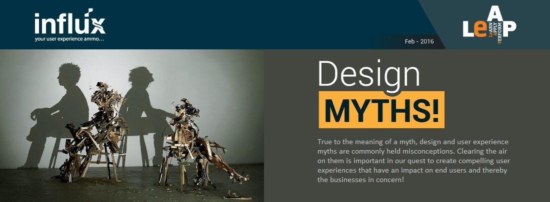
| In this edition of the “Influx”, we have picked the top 10 of them which we think are important, while also leading you to a few others which you can read in leisure. | ||
 |
||
Read on for more details on these myths… |
||
| #1: User Experience Design is about making a website/ product/ application look good | ||
| A very common myth that exists in our industry is that User Experience Design is about making a website/ product/ application look good. And due to this myth, proper user experience resources are not included in the SDLC causing a lot of user experience and usability issues, which ultimately leads to dissatisfied users. And not to mention the additional time and resources spent in fixing the issues late in the development cycle. So if it’s not only about how it looks… what is it? Like Steve Job said… Design is not how it looks but how it works! | ||
| . | ||
| #2: People read through thoroughly | ||
| However important we feel the content is, users do not always read through content word by word as is expected of them. Moreover with the attention span decreasing by the day, users usually skim the pages looking for highlighted keywords, meaningful headings, short paragraphs and scannable lists. Since users are generally in a hurry to find the piece of information they’re looking for, they’ll skip what’s irrelevant for them. So we ought to be spending time organizing and presenting our content effectively… highlighting key words and paragraphs, etc. It’s time to rethink our content strategy. | ||
| . | ||
| #3: All pages should be accessible in 3 clicks | ||
| Experts have for long challenged the 3 click rule and it has also been discovered through usability studies. All the more in complex products and applications with complicated work flows like we see in a lot of enterprise applications. What is important here is to ensure that the navigation is easy and the fact that we are keeping the users engaged and interested in the work flow. | ||
| . | ||
| #4: People don’t scroll | ||
| For a long time, users did not like to scroll (especially in the late nineties). However that has changed and in the recent times scrolling has become natural and people prefer scrolling rather than information being split into pages or sections. From a design point of view it has helped and designers don’t need to squeeze everything into a homepage or fit everything above the fold. This creative freedom is allowing a lot of breathing space and creativity in the designs… all that is needed is to ensure that the important information is placed in the right areas and there exists a proper flow of information. | ||
| . | ||
| #5: Icons enhance usability | ||
| Why do you think in most places we have text alongside a graphic or an icon or a signboard? It’s because research has shown that icons mean different things to different people, are hard to memorize and are often highly inefficient. Outlook is a great example where an icon-only approach did not work but introduction of text fixed the recognition and usability issue. | ||
| . | ||
| #6: We are all like the end users | ||
| This is another common misconception that prevents us from soliciting requirements or feedback from the end users. We as conceptualizers, designers and developers of the product or application, often tend to assume that we are all like the users. So basically if we get it… the actual end users should too. This is one of the primary reasons products and applications fail as they have not considered the needs of the actual end users. Usability studies have often not only proved us wrong but shared insights which we had no clue about. Make sure you don’t make the same mistake. | ||
| . | ||
| #7: Search will solve all navigation problems | ||
| Search – what worked well for ‘google’ was considered the best approach to solve all navigation problems. What people did not realize is that users tend to scan for information in a methodical fashion, grasping and accessing key words and only when they are not able to find information they end up searching for information. People are better at recognizing things than recalling them from memory. And hence search will NOT solve all navigation problems. | ||
| . | ||
| #8: White space is wasted space | ||
| There are many who consider any additional ‘space’ (referred to as white space) found in the design of websites, products and application as wastage of valuable screen estate. Apart from providing a better look aesthetically through the visual layout, white space also helps in better readability and content prioritization. Use them liberally! | ||
| . | ||
| #9: If you are an expert, you don’t need to test your design | ||
| Since people rarely behave the way you expect, an expert (UX expert) can find major usability problems, but usability tests (tests performed with actual users) always reveal surprising issues. Usability testing and expert reviews are both useful and tend to have different findings, therefore it’s usually recommended to combine the two in order to get the most comprehensive analysis of the interface. Factor it in your project! | ||
| . | ||
| #10: Success happens overnight (from a UX point of view) | ||
| Design is often considered like a quick paint job that is done at the fag end of the project, one that needs no thinking… just plain execution. While on the contrary design requires a series of collaborative exercises where we research, ideate, design and build. Sometimes in the process we fail but the fact that we fail early helps us in regrouping and redesigning based on our findings and not on perception. | ||
| . | ||
| Here are some detailed articles on user experience and design myths: | ||
| . | ||
|
http://sillycow.de/web-design-32-ux-design-myths/ http://think360studio.com/18-common-ux-myths-exposed-and-fixed/ http://www.creativebloq.com/infographic/10-myths-about-graphic-design-101517164 http://www.shutterstock.com/blog/5-common-myths-about-graphic-design-debunked |
||
| . | ||
 |
||


![]()
Copyright © 2020 emids.
All rights reserved.